Rooted Apple Butter is an artisan apple butter brand I created that’s all about warmth, nostalgia, and a deeper connection to where our food comes from. The concept grew from my love of apple butter in the mornings on a warm piece of perfectly toasted toast. Through color, type, or overall feeling, I wanted the visuals of this brand to reflect the enjoyment I receive when eating one of my favorite snacks!
Final Logo
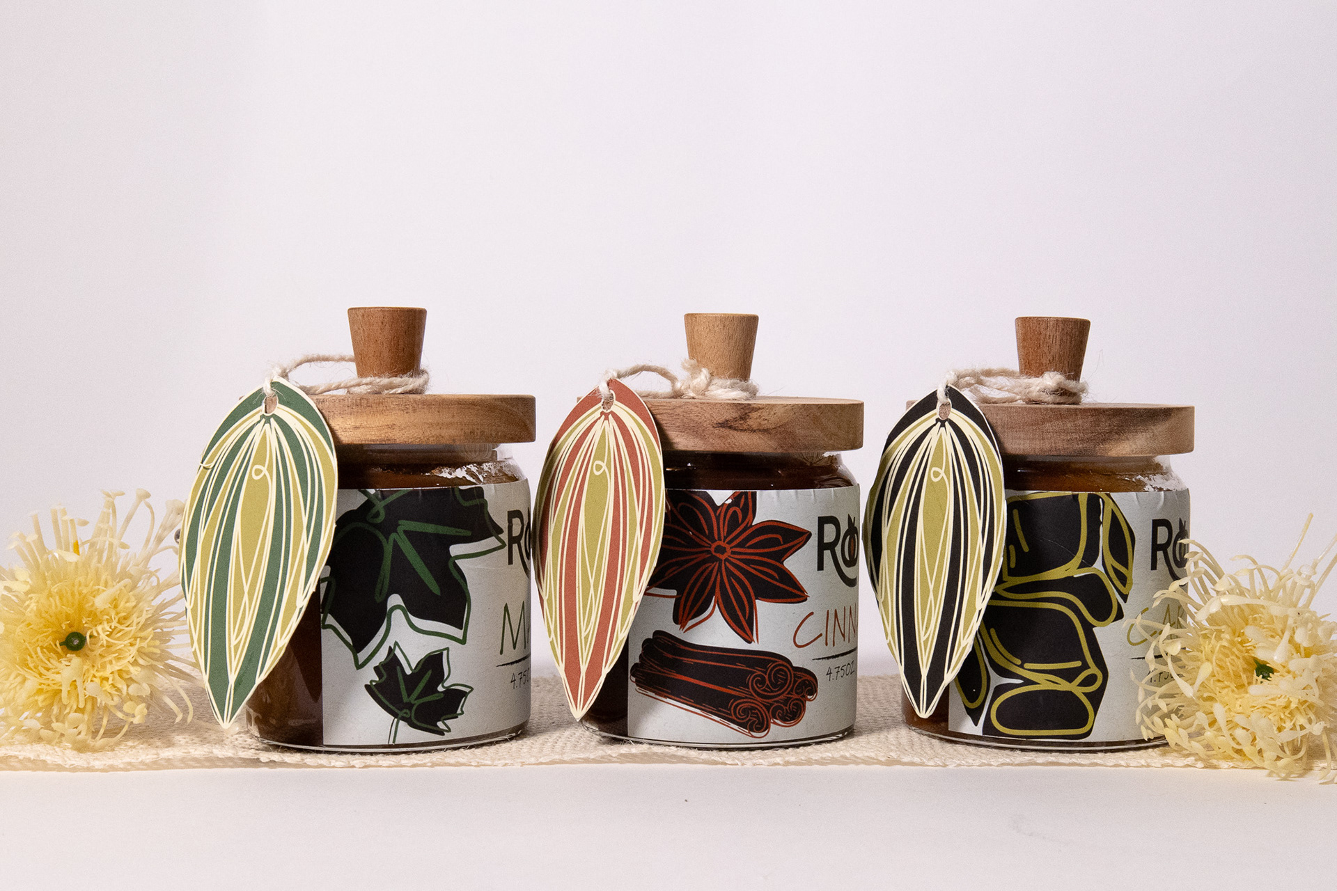
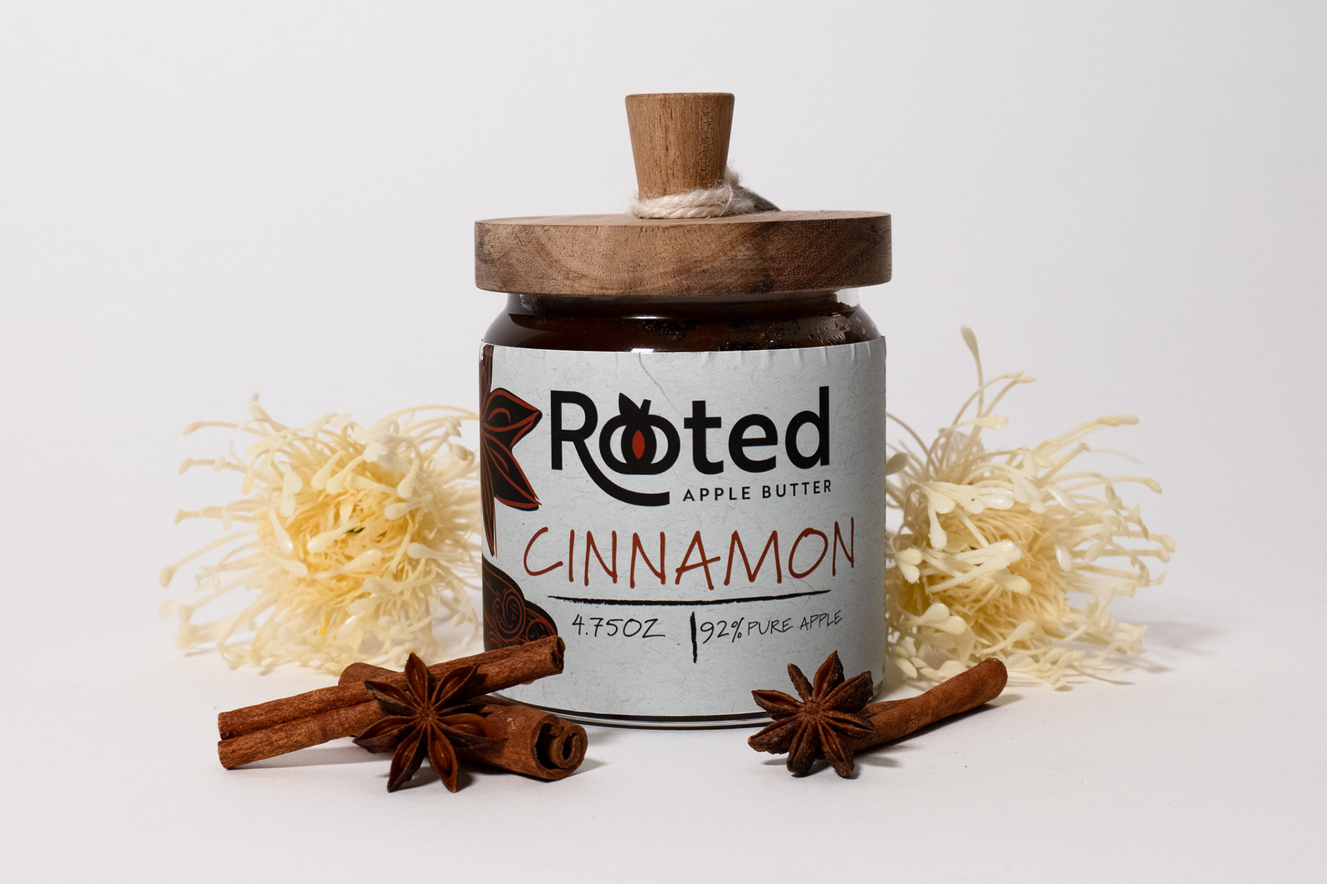
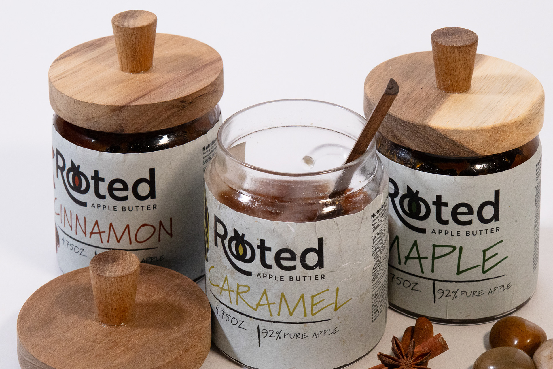
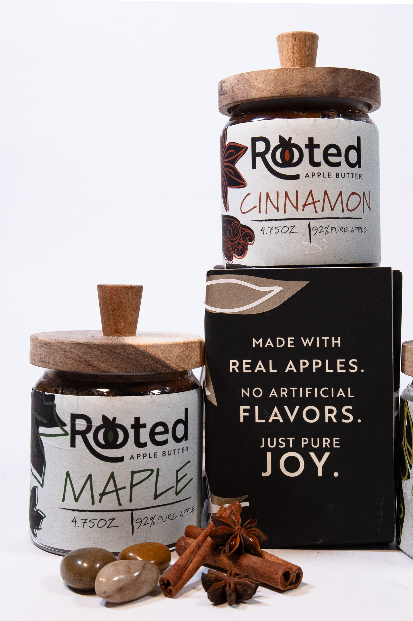
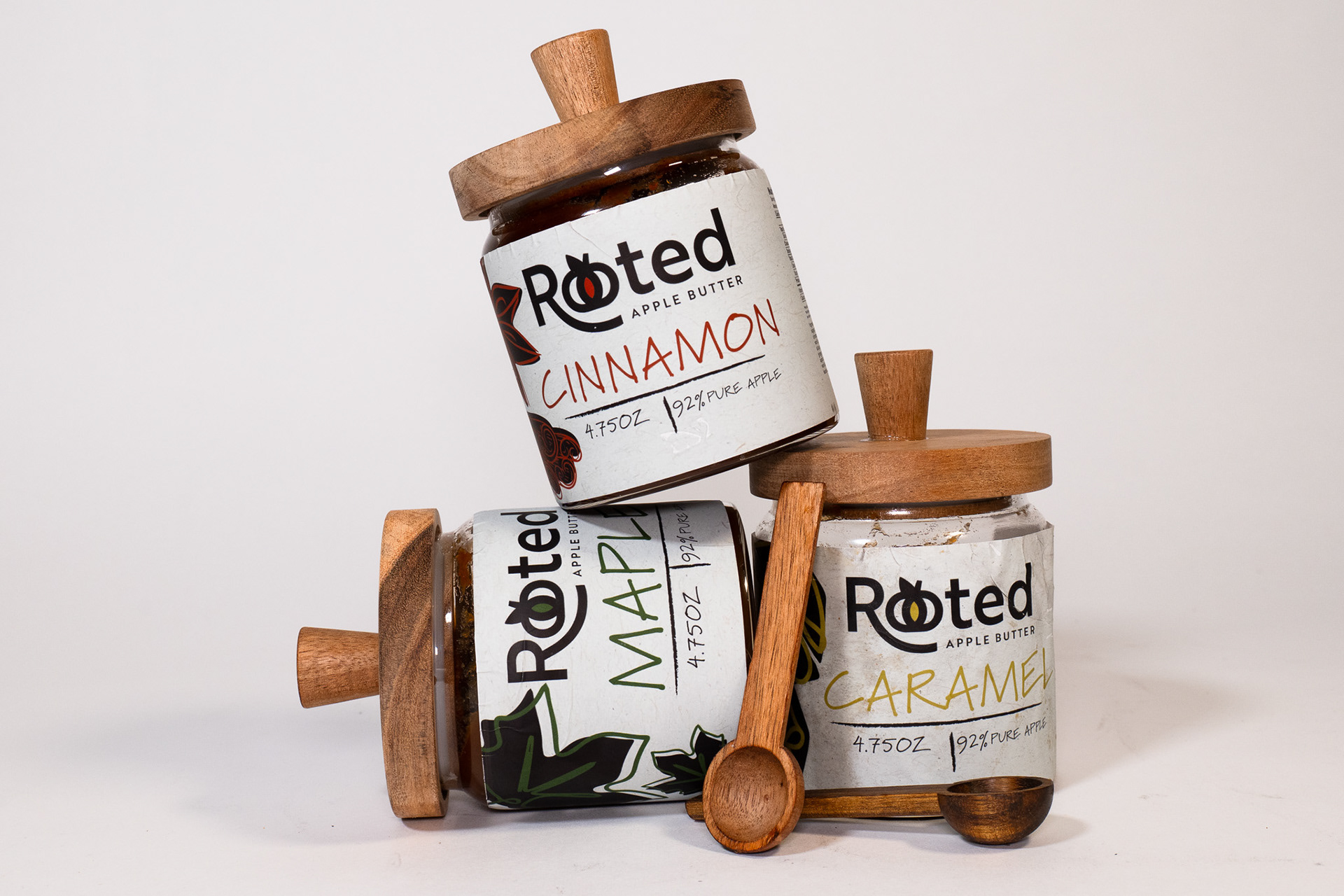
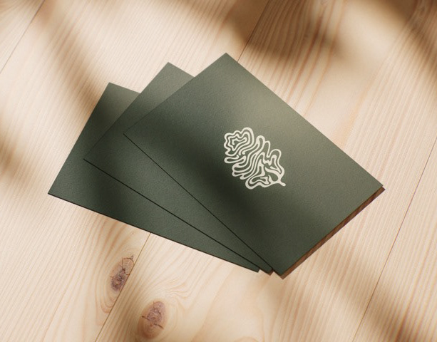
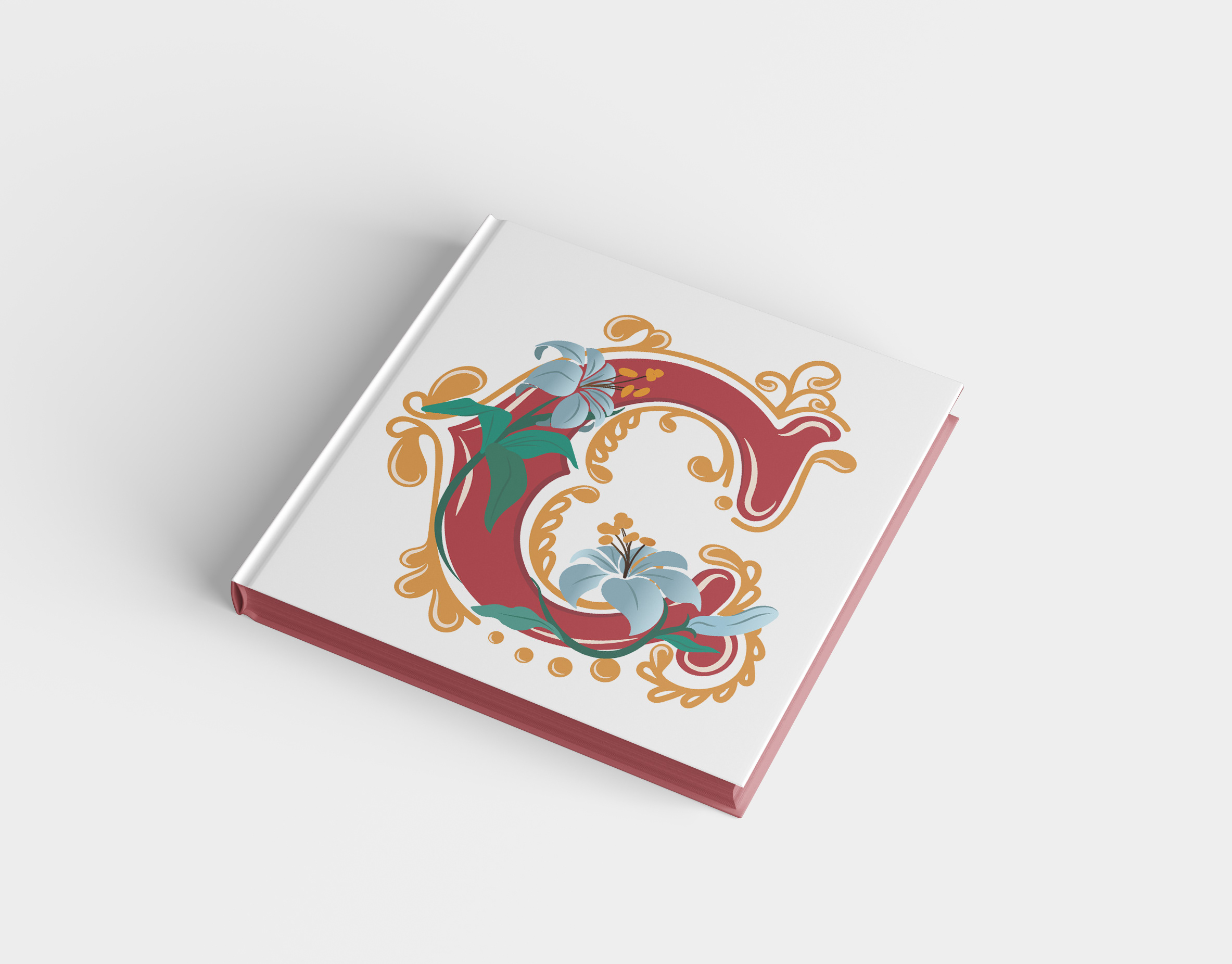
The name Rooted felt like the perfect way to describe my feelings when enjoying this tasty snack. The logo leans into the intended symbolism with a custom typographic “oo”, that communicates both the word "rooted" and depicts a ripened apple. Each flavor including Cinnamon, Maple, and Caramel, have their own hand-drawn seasonal motif, tying the variety of apples and flavors back to nature without relying on cliché imagery.
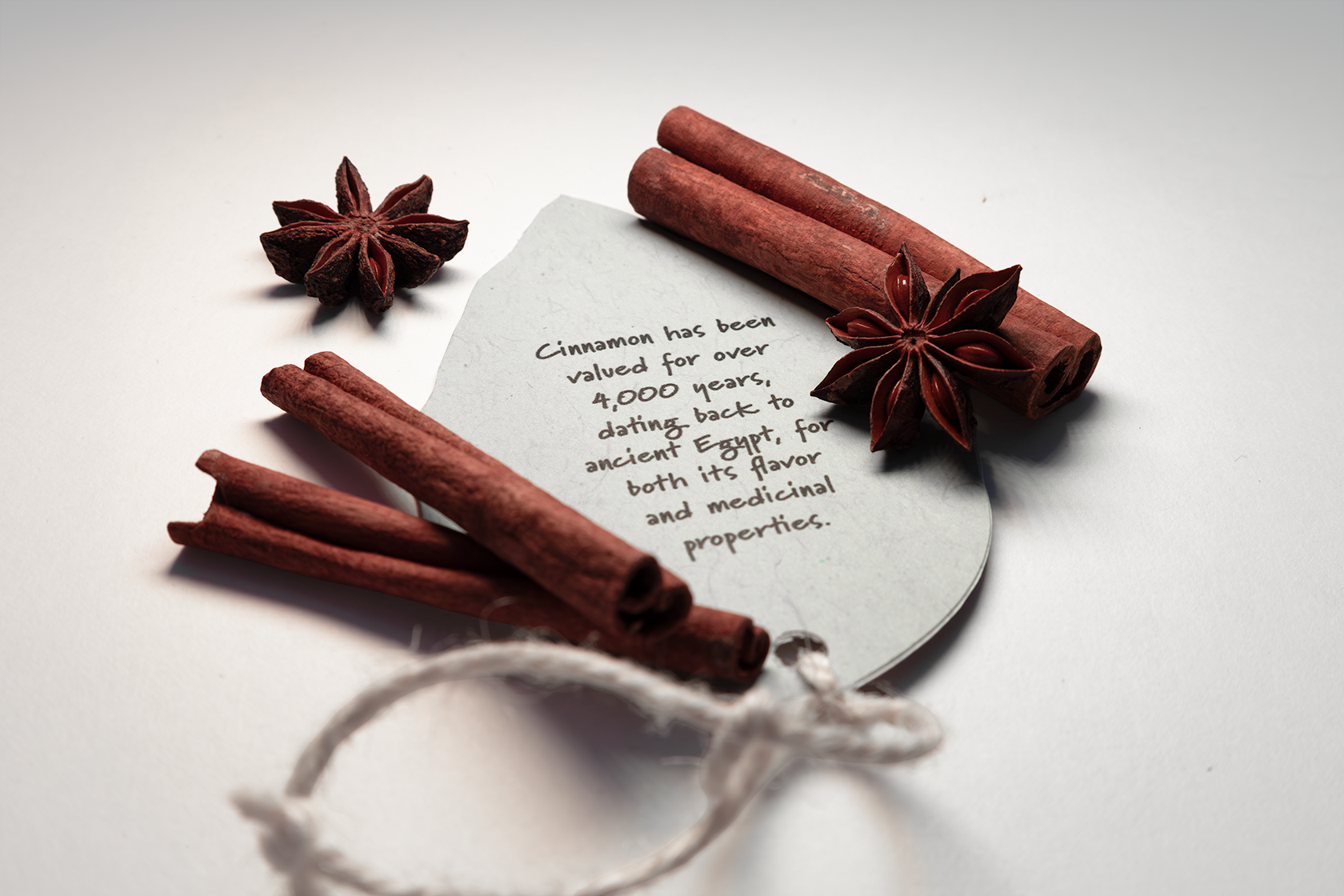
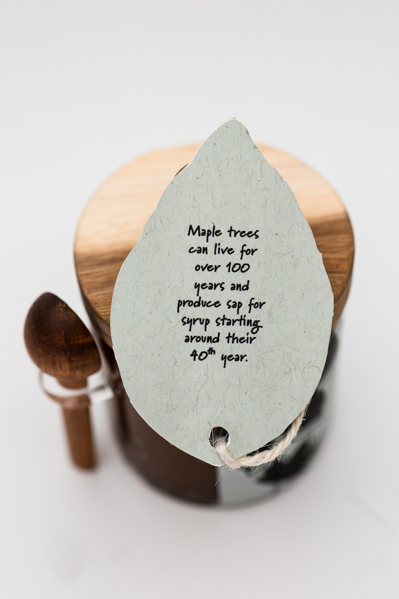
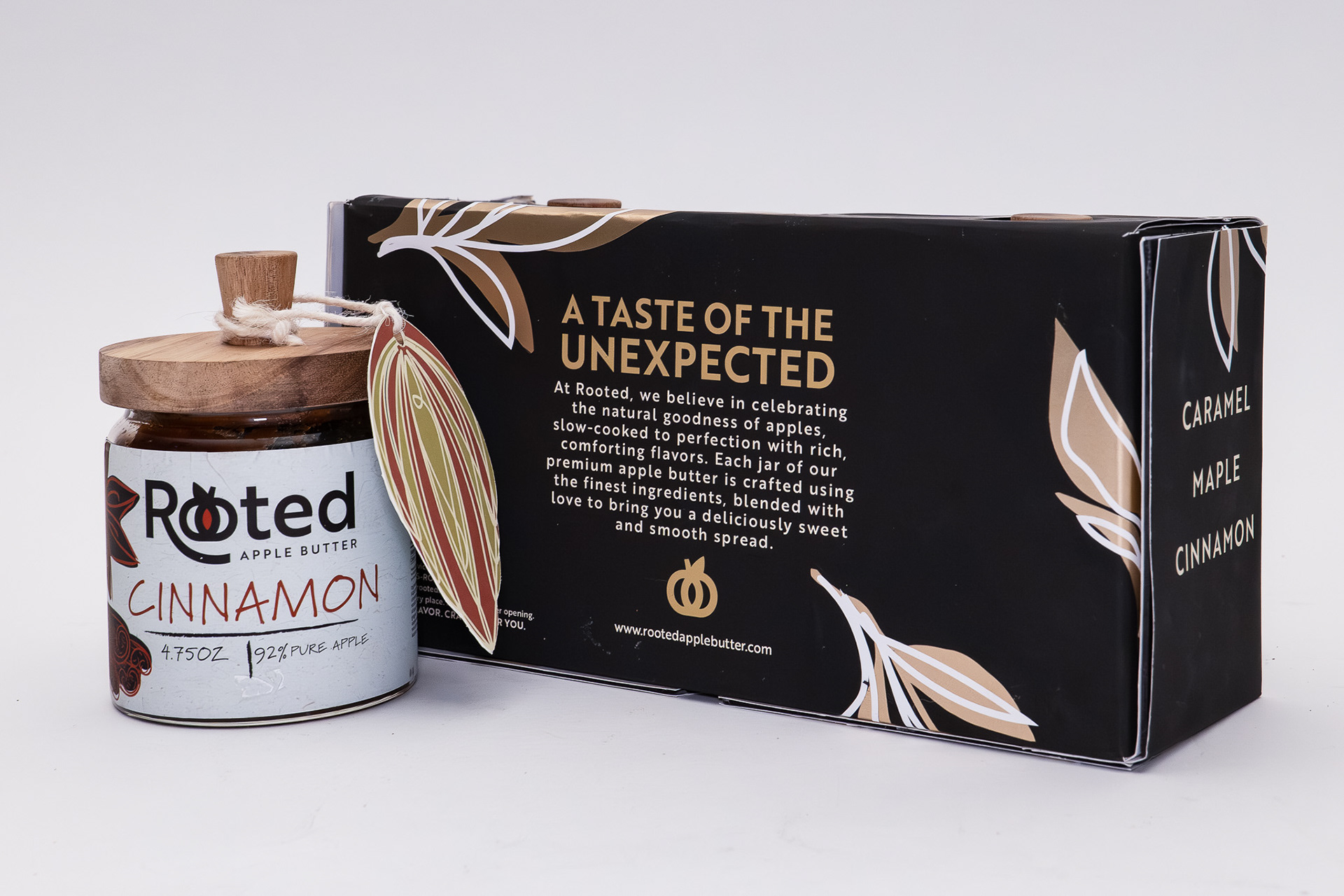
The packaging is built around balance. Minimal yet textured, modern yet rustic. I chose wood-topped jars to emphasize genuine craftsmanship and paired them with soft-touch labels and handwritten typography to keep it approachable. The gift box design uses deep metallic tones and delicate botanical illustrations to contrast the raw wood and bright packaging inside. Everything, from the tag design, to the layout of the flavor names, was crafted to feel thoughtful and intentional. Something you’d be excited to give or keep for yourself. Creating Rooted wasn't just about apple butter, but about slowing down, tasting deliberately, and feeling connected to the little things that nourish us.