K9s United is an organization that focuses on protecting and supporting K9 units that serve or have served alongside law enforcement officers.
This project focuses on redesigning the organizations current logo, and utilizing negative space effectively within concept branding.
This project focuses on redesigning the organizations current logo, and utilizing negative space effectively within concept branding.
The nature of a K9 unit's career follows colors that are commonly found throughout law enforcement situations including colors red, white, and blue. The original logo carries these colors, and a heavy boldness using varsity adjacent typography and a detailed depiction of a front facing K9. Fundraising and support for this organization is raised through individual donations, partnerships, merchandise sales, events such as fundraisers, and volunteer work. Because of external aversions, personal experiences, criminal backgrounds, and other factors, many people avoid interacting with figures of authority and surrounding systems which include support to our K9 units. To strengthen the organizations funding and introduce new members, focusing on clear but confident imagery when recreating this logo was important.
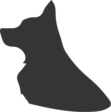
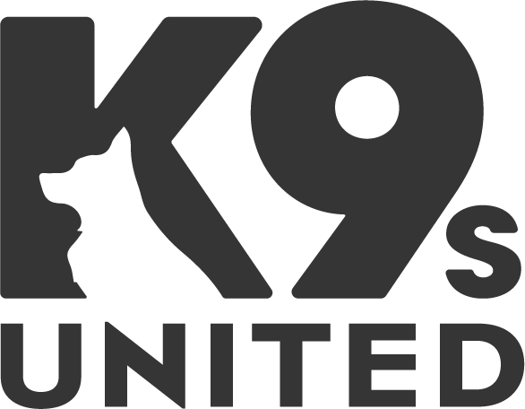
The choice to integrate a German Shepard into the recreated logo was strongly influenced by the resemblance of the traditional canine used in modern day law enforcement, and to clearly continue the message of the original logo. To cater the typographic elements of the logo to a broader community, the heavy, block-like typography was replaced with something that visually carries courage, but also delivers a simple, clear message with softer edges. This differs from typography often used by law enforcement agencies and encourages individuals not familiar with the organizations message to interact with their mission without bias. Simple but disciplined imagery of the K9 is composed within the "K", filling the negative space of the letter; subtly reenforcing the intended message.
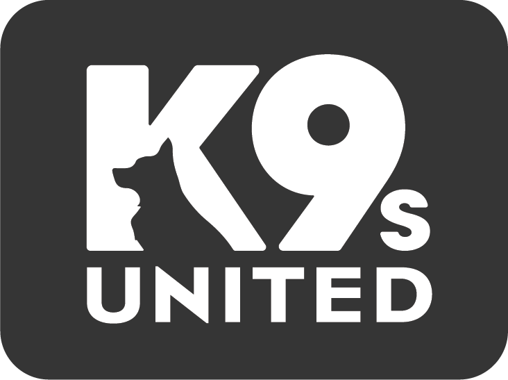
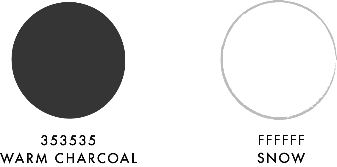
The simple color palette consisting of charcoal and white supports versatility use of the logo, allowing it to be combined with various background colors. This cost effective option gives organizers the ability to chose more affordable merchandise during event planning and overall distribution of funds.
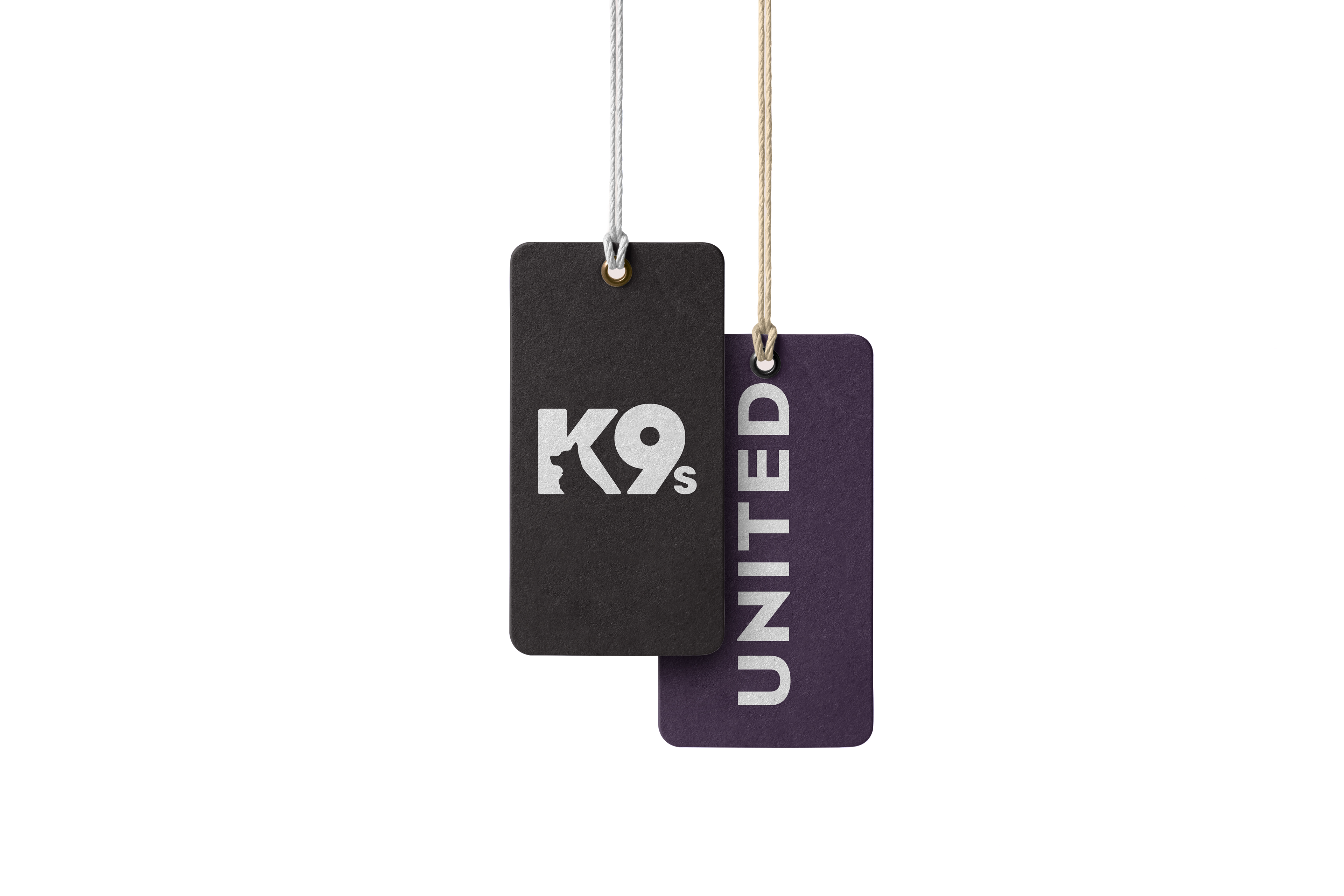
K9s United Dog Tag
Keeping the mission and subject clear and embodying the courage and strength it takes for our four legged friends to work in law enforcement, was crucial when finishing my version of the logo. Most importantly, the finished logo needed to have an updated appearance, that inspires new interest within communities that might not be encouraged to interact with organizations funding elements of governing forces, while simultaneously honoring the sophistication and courage of K9 units.
The recreation of this logo for K9s United provides potential for new and increased funding, as merchandise, printed promotion, signage, and other materials containing the logo, and supporting graphics, can be sold and shared to support the organizations cause. In return K9 units would have an increase in funding and volunteer support, which directly affects their care, training, equipment, and treatments.