This editorial project is composed of a magazine cover along with two spreads that showcase the importance of typographic hierarchy. The article itself pertains to MF DOOM, a late UK hip-hop artist and goes into the makings of his album "Doomsday".
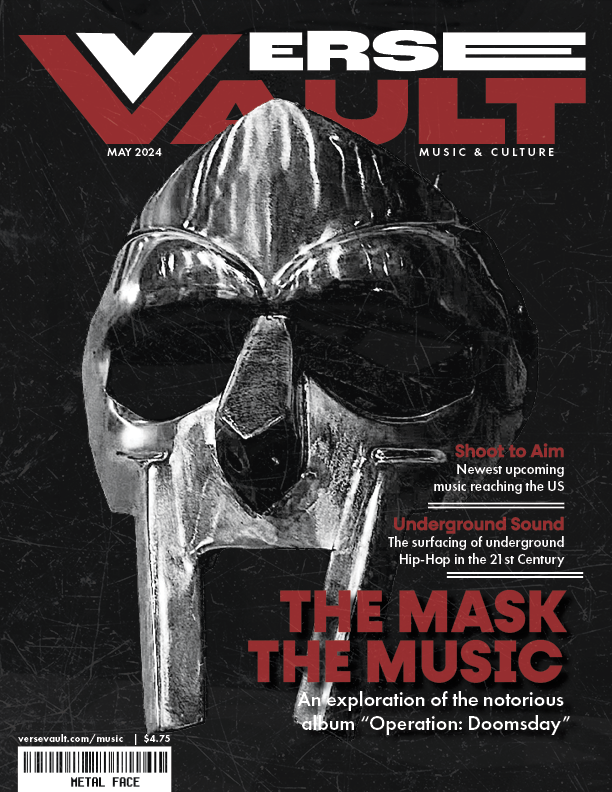
Verse Vault | Magazine Cover
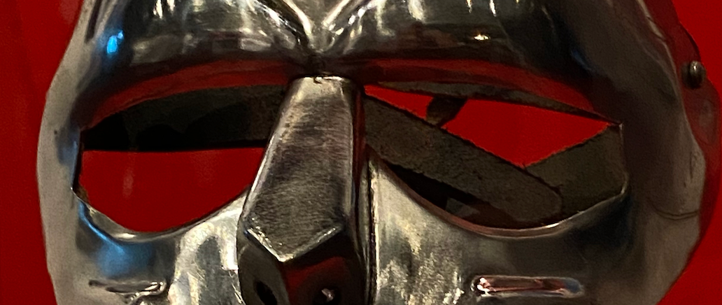
The creation of this project included crafting a magazine brand and highlighting a subject within the magazines culture on the cover, to then create two spreads; one with body-heavy typography, one combining graphic elements with simple headlines and captions to highlight the subject. While working on this project, it was important that the cover felt as bold and mysterious as the featured artist MF DOOM himself, using heavy textures, sharp contrast, and intentional type hierarchy to set an underground tone. To create depth, the mask is placed over the nameplate, taking the foreground. The already red and black color palette of the Verse Vault brand, paired with the page engulfing image of his mask, help build the gritty energy DOOM was best known for.
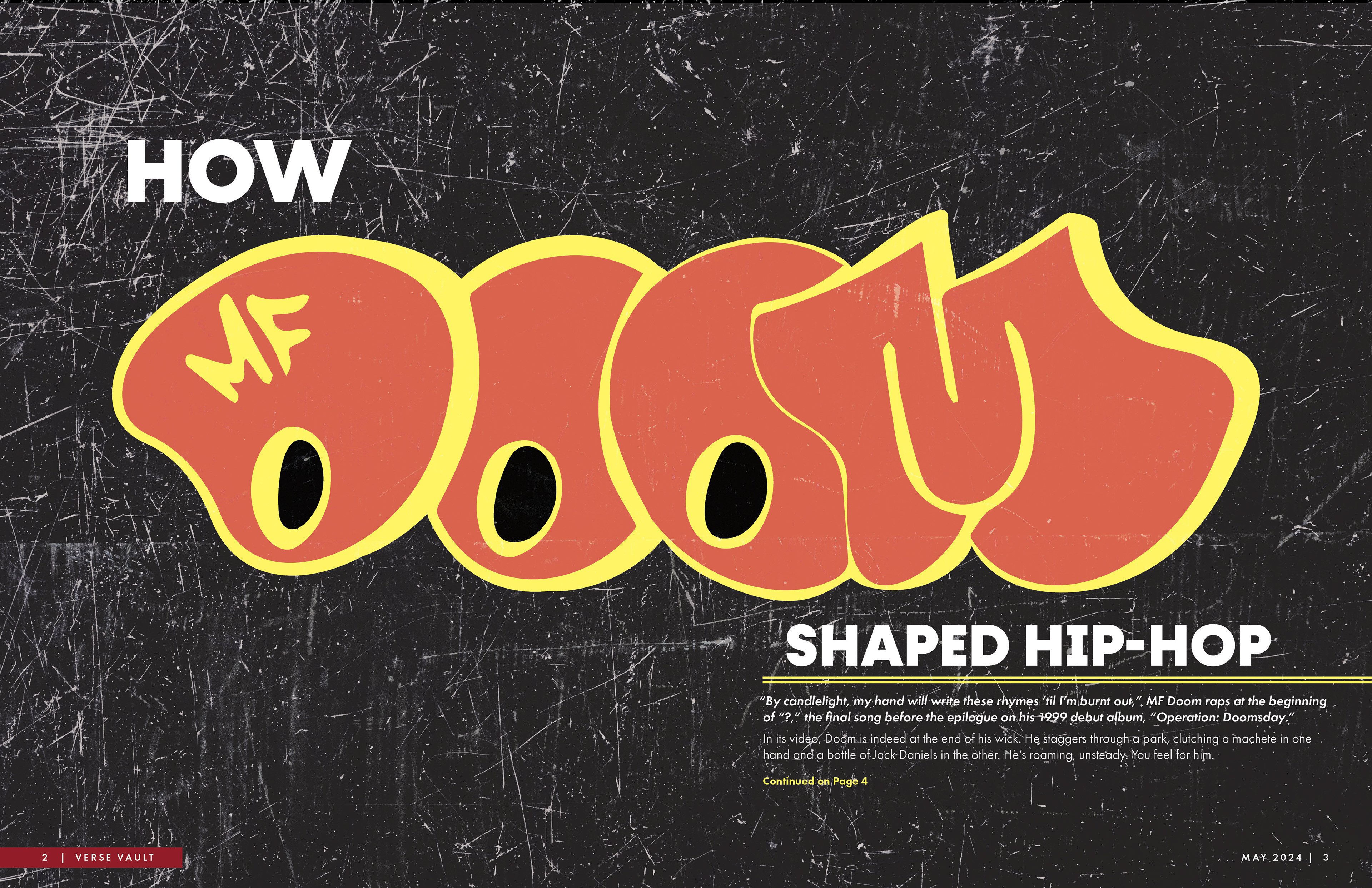
Verse Vault | Featured Spread
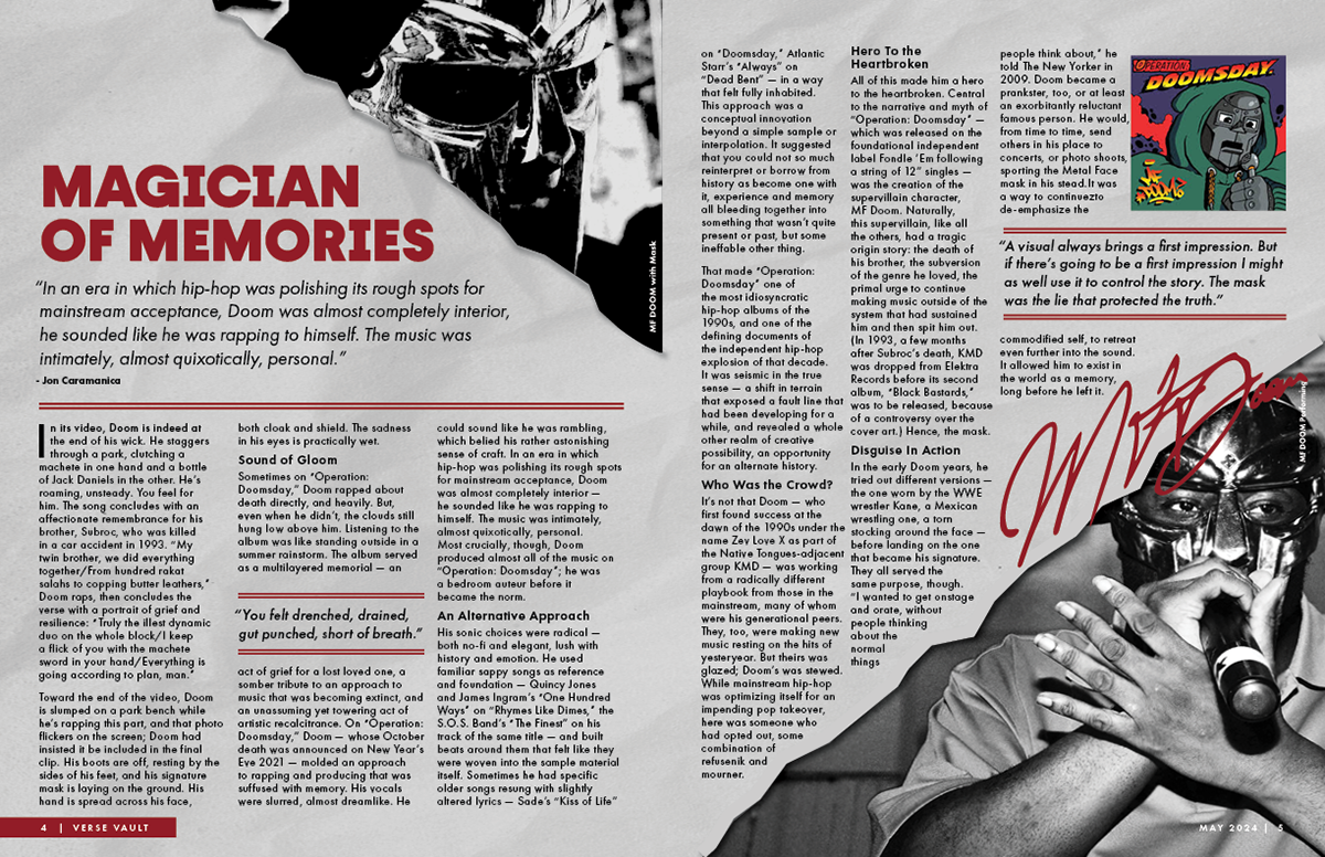
Verse Vault | Article Spread
The “How MF DOOM Shaped Hip-Hop” feature spread includes hand-drawn, replicated type to nod to DOOM’s original influences. The sticker-like graphic is paired with minimal type carrying the same structure found on the cover of the magazine edition.Inside, the layout containing the main article leans into a layered, almost collage-like approach that reflects his unpredictable discography. I played with type, scale, and texture to give it movement and rhythm, as if you were listening to verse while reading each page. There was crucial focus on using texture throughout all spreads to unify and continue the immersion while reading. This project was a chance to explore experimental editorial design while paying tribute to an artist whose visuals and voice were anything but ordinary.
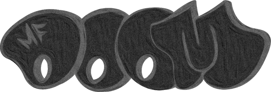
Rendition of MF DOOM Logo
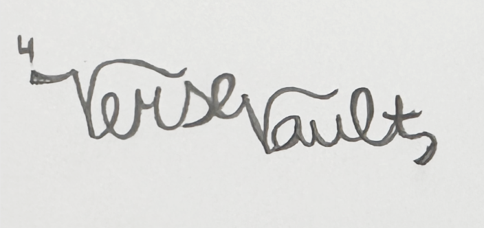
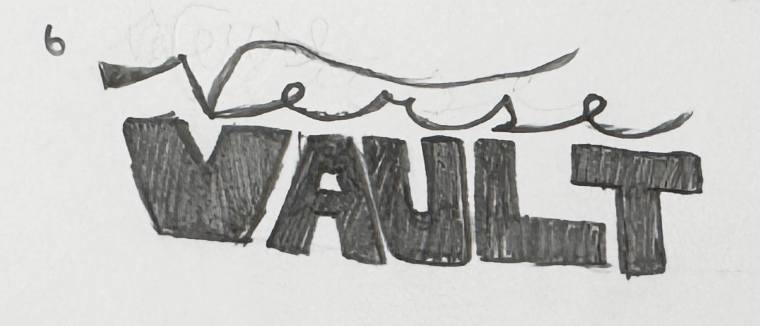
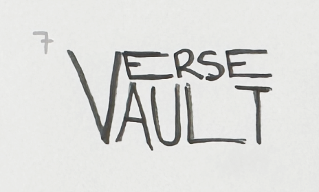
The Creative Process

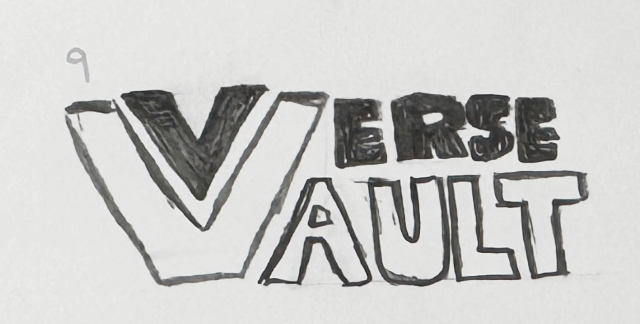
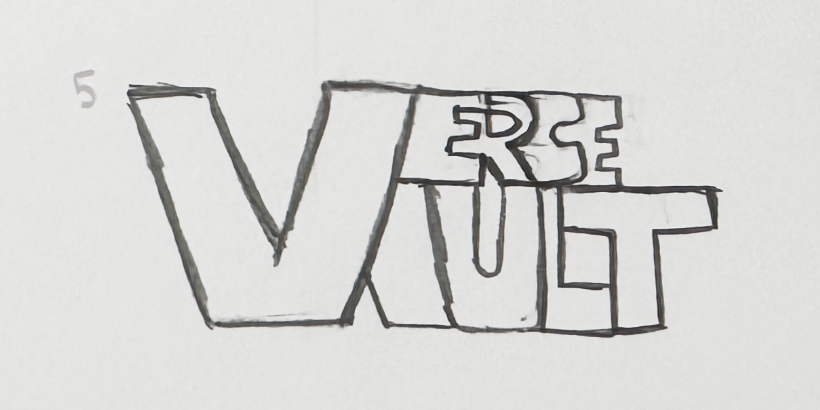
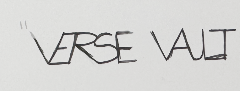
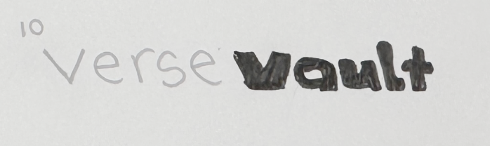
The Verse Vault logo went through a lot of experimentation before landing on the final version you see here. I created eleven nameplate variations, testing everything from clean modern typography to more distressed, graffiti styles. I wanted something that felt bold, like it belonged on a record sleeve from the 90s, but still felt sharp enough to work on a contemporary editorial piece.
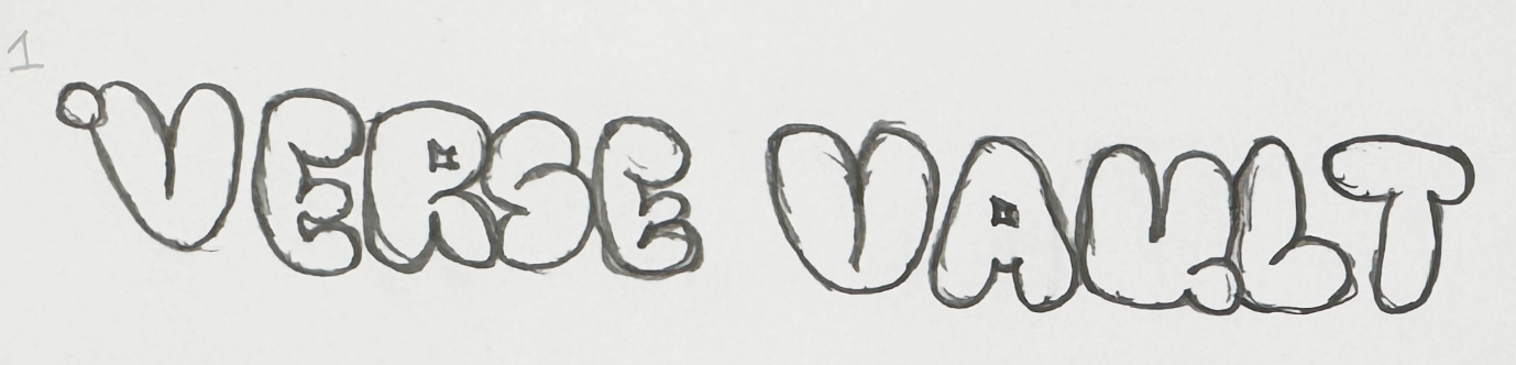
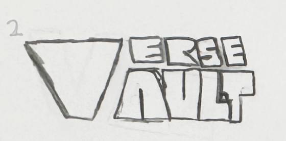
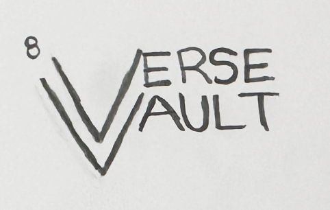

Final Logo
The final logo is a blend of strong, geometric letterforms, with the “V” in "Verse" and "V" in “Vault” intentionally overlapping, creating a sense of unity between the name and the visual identity. The title "Verse Vault" was chosen because of the magazines primary focus on music, acting as a vault for news and entertainment regarding the music industry and surrounding culture. It was important to me that the logo could stand confidently on a gritty, high-contrast cover without getting lost, while also being flexible enough to work on quieter covers depending on future editions.
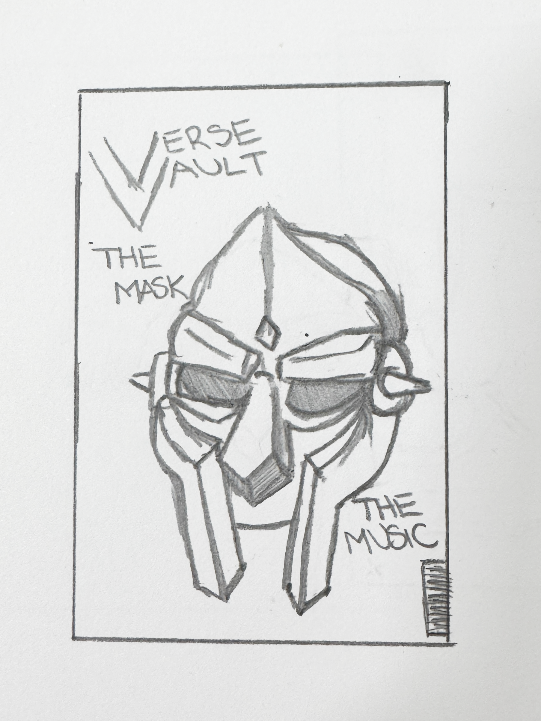
Cover Sketch
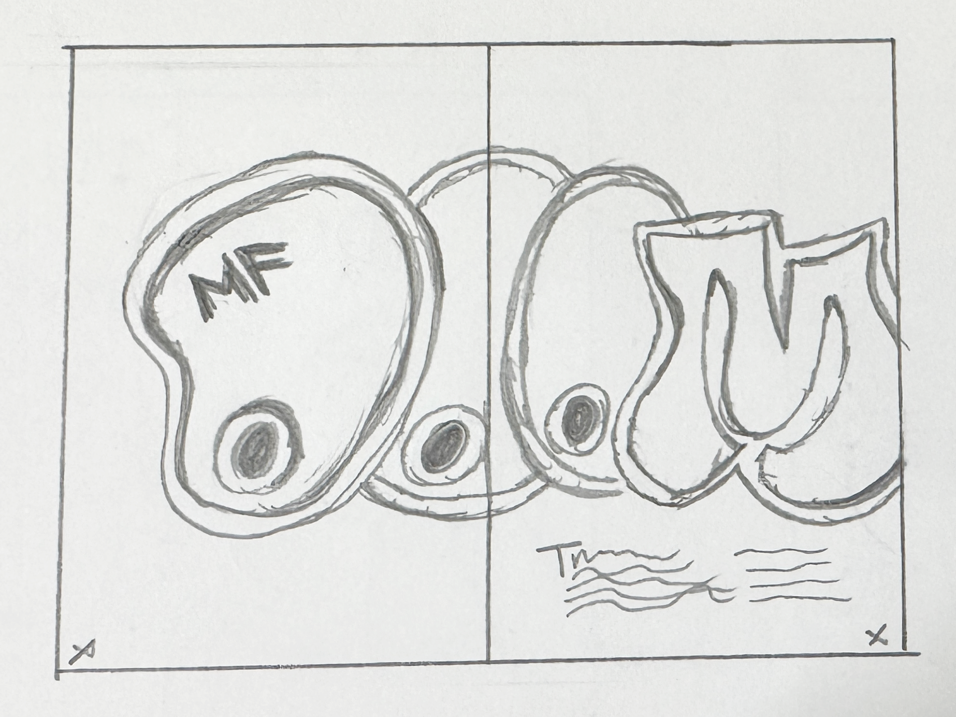
Feature Spread Sketch
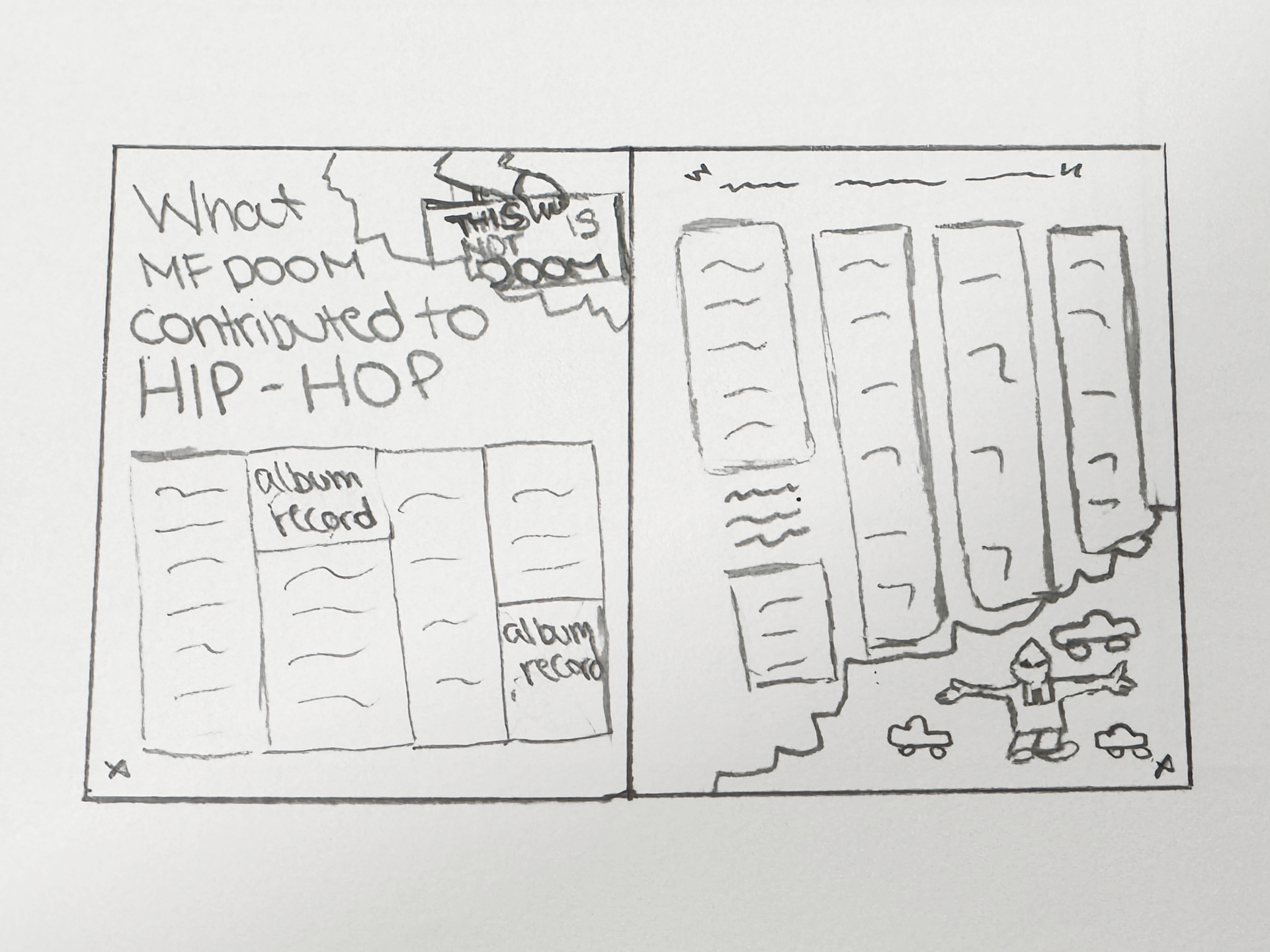
Article Spread Sketch
The initial sketches for this magazine brand focused on exploring different visual directions for the logo, feature spread, cover, and article layout before committing to a final design system. I explored variations in typography, hierarchy, and grid structures to find a balance between readability and strong editorial presence. I was eager to include a picture of the real MF DOOM mask I took on a trip to the MoPop within my design, which ended up being featured on the cover of the magazine. Through experimentation with multiple layouts, the combined three sketches above were selected and converted into the final assets, ultimatly creating Verse Vault.
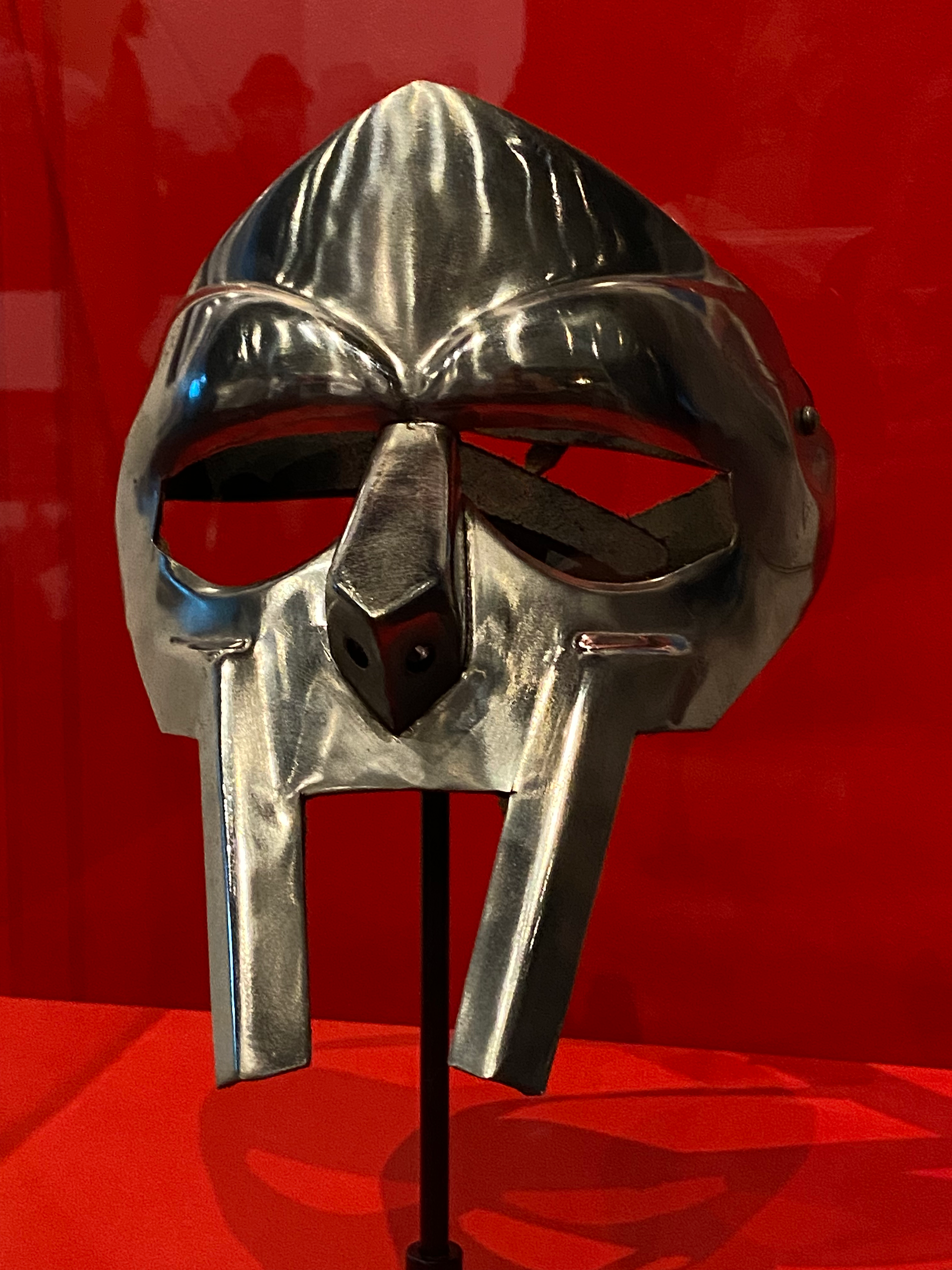
MF DOOM Mask | MoPop, Seattle
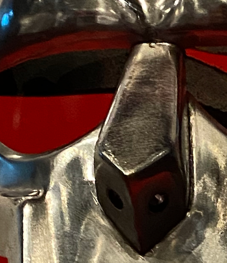
MF DOOM Mask | Close Up