This custom decorative letterform showcases the letter “C", and functions as a drop cap. The goal of this project was to blend type and illustration into something ornamental and expressive.

The project started with finding a bold serif "C", which was altered to accommodate the finer details of the piece and to conserve the literacy of the letter itself. I then built out the flourishes and floral details around it, inspired by vintage illuminated manuscripts and Victorian drop caps. The color palette leans warm and classic, with soft blue lilies adding contrast against the rich red and gold.
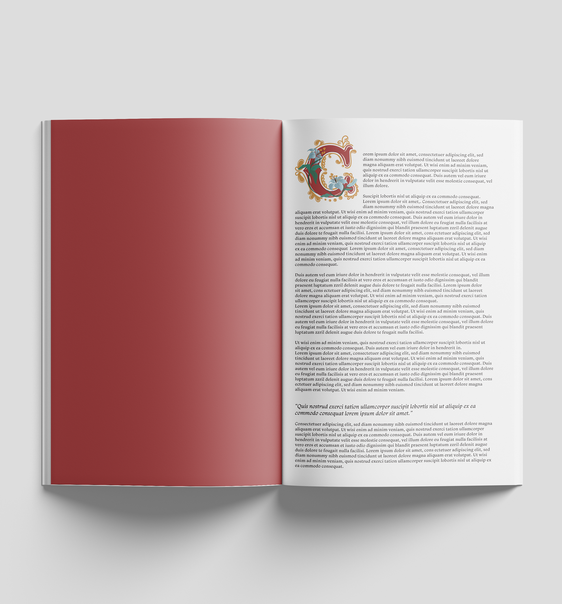
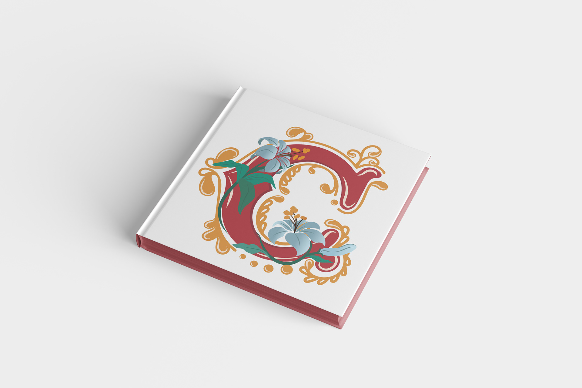
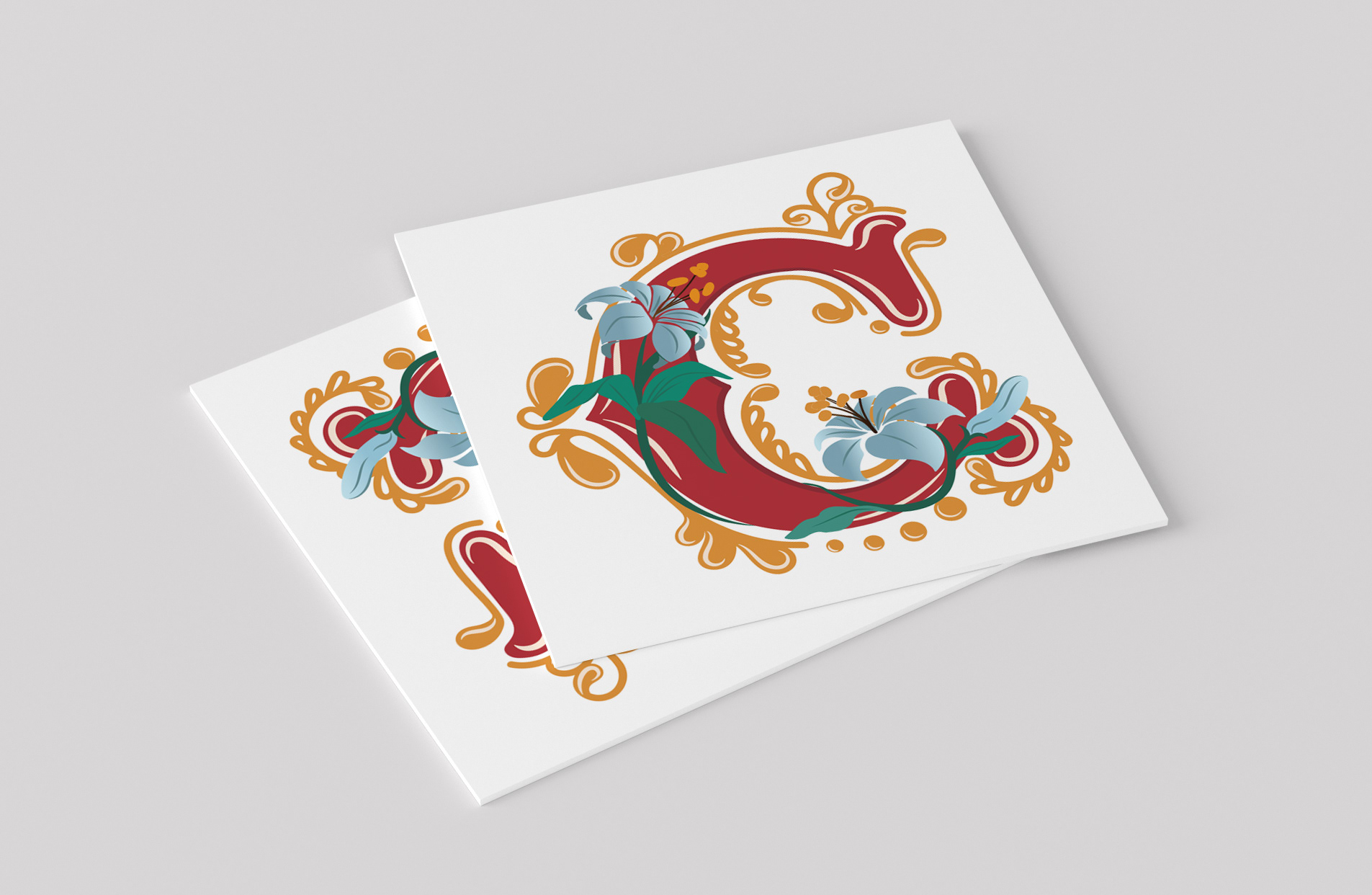
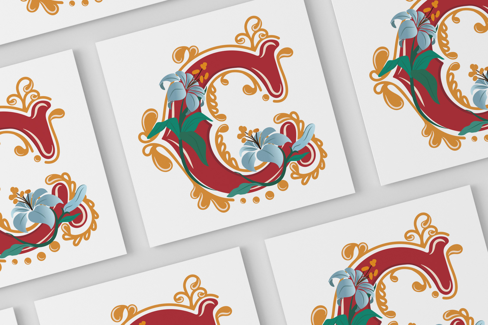
Details were entirely drawn by hand in Illustrator, with a focus on smooth curves, layered shapes, and intentional visual symmetry. I wanted it to feel both elegant and playful, like it could live in a storybook or as a monogram. This piece gave me a chance to explore typography in a more illustrative, expressive way while still keeping the structure of the letter recognizable.