Oak & Ember Counseling is a therapy practice in the Inland Pacific Northwest, offering mental health services throughout Washington State.
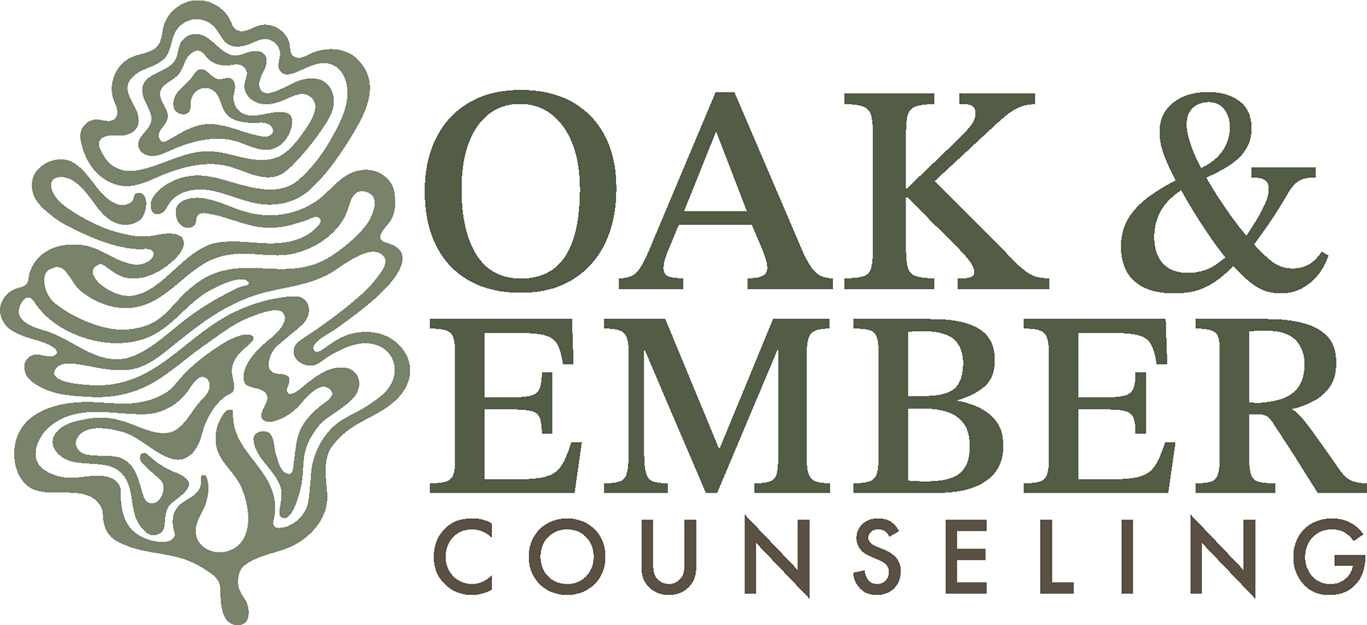
Main Logo
The focus of this project was to effectively create a visual identity and website for a therapy practice that stands out but also feels familiar. The brand package included a main and secondary logo, along with a website, basic SEO optimization, business cards, and social media graphics to promote supporting your mental health and to introduce new clients to a safe welcoming space.
The creative process for Oak & Ember Counseling began with extensive research into competitor branding within the therapy and wellness space, both locally in the PNW and nationally. Research of symbolism surrounding oak trees and embers was also extensively researched. Themes of strength, growth, resilience, and renewal became the foundation of Oak & Ember Counseling's visual identity. From there, mind mapping and hand sketching helped explore different visual directions in preparation to discussing concepts and goals directly with the client to determine the most fitting approach for the brand.
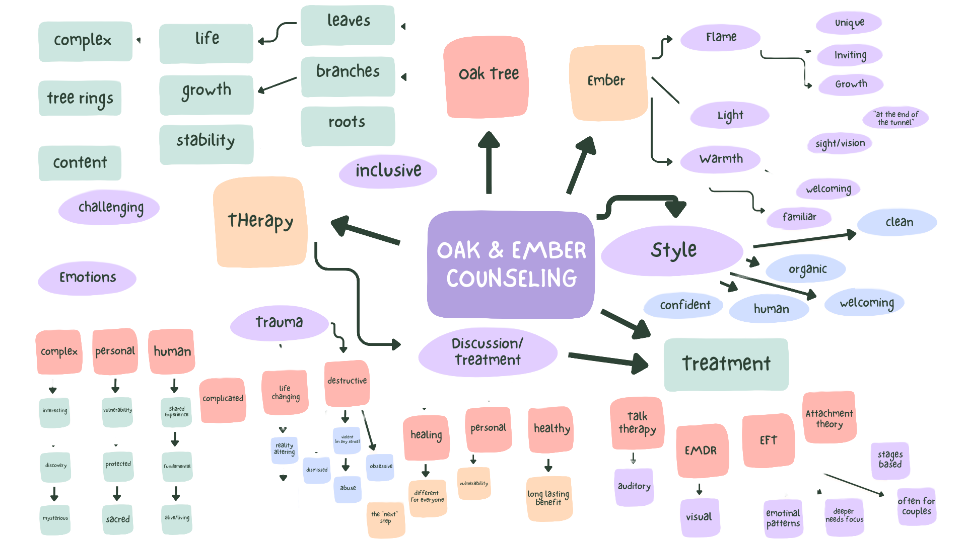
Mind Map
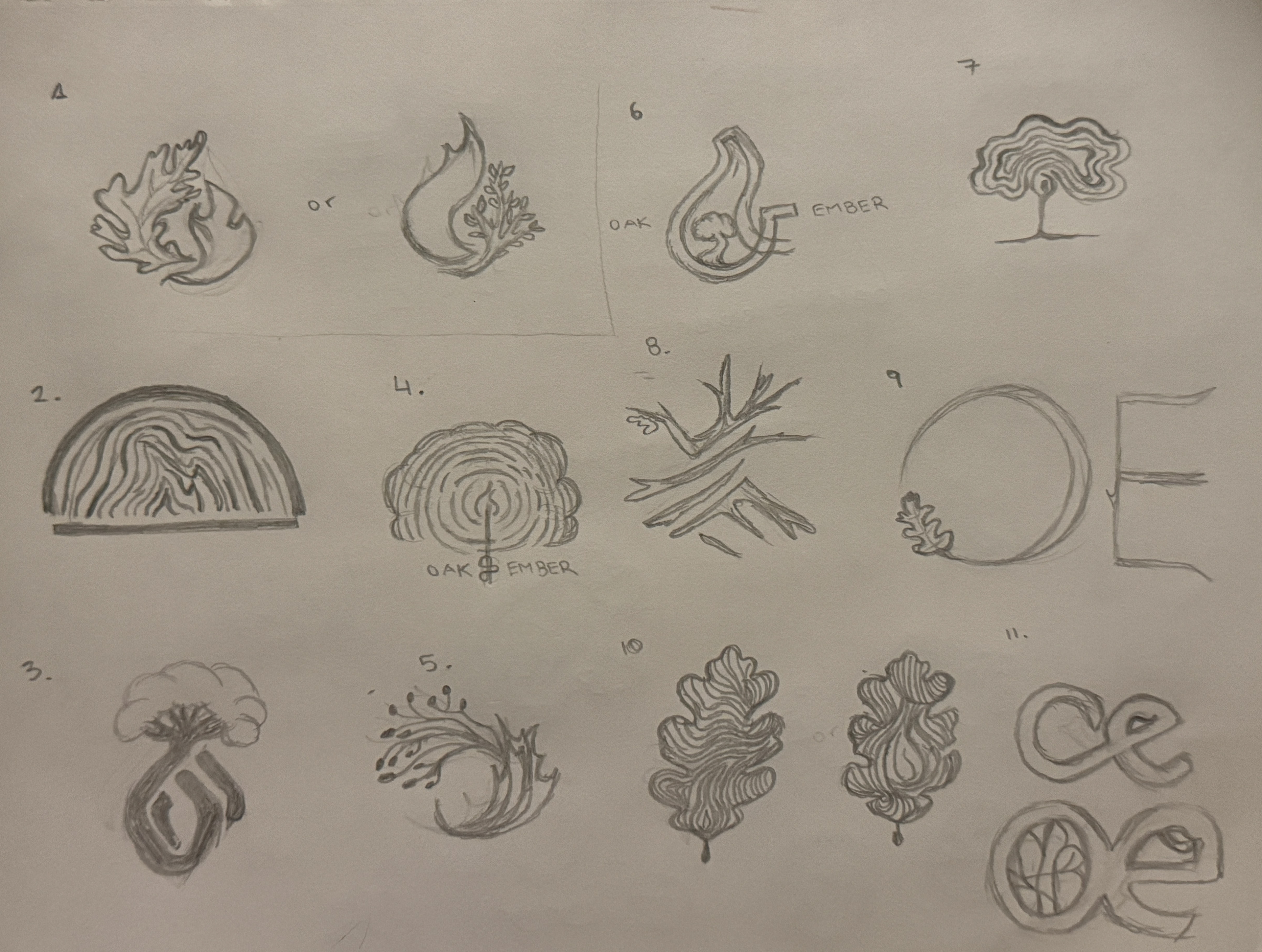
Logo Sketches
After multiple rounds of rough concepts and refinements, a final logo direction was selected and developed into a complete brand identity system. The final mark combines an abstract oak leaf with a subtle flame shape embedded within it, creating a balance between modern minimalism and recognizable therapeutic branding. The line work was chosen to be organic to give the logo a sense of movement, while the typography complements the symbology through balance of professionalism, sophistication, and legibility. Together, the unique icon and typography create a logo that feels grounded, calm, and trustworthy.
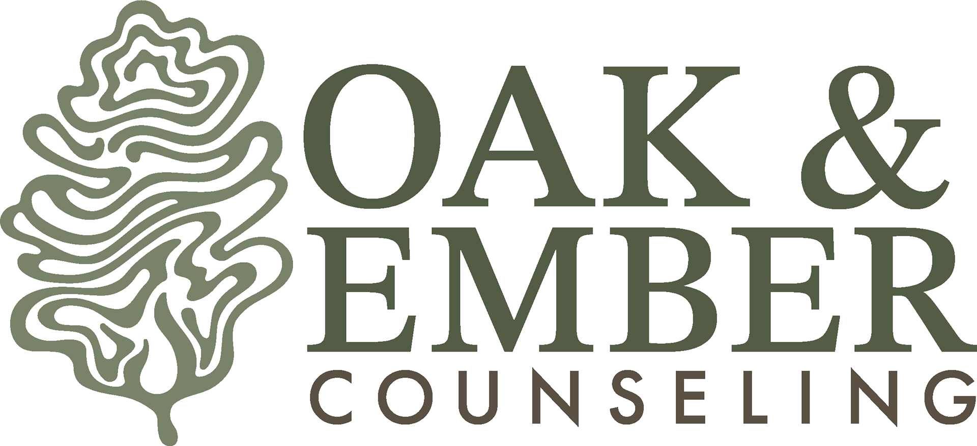
Final Logo
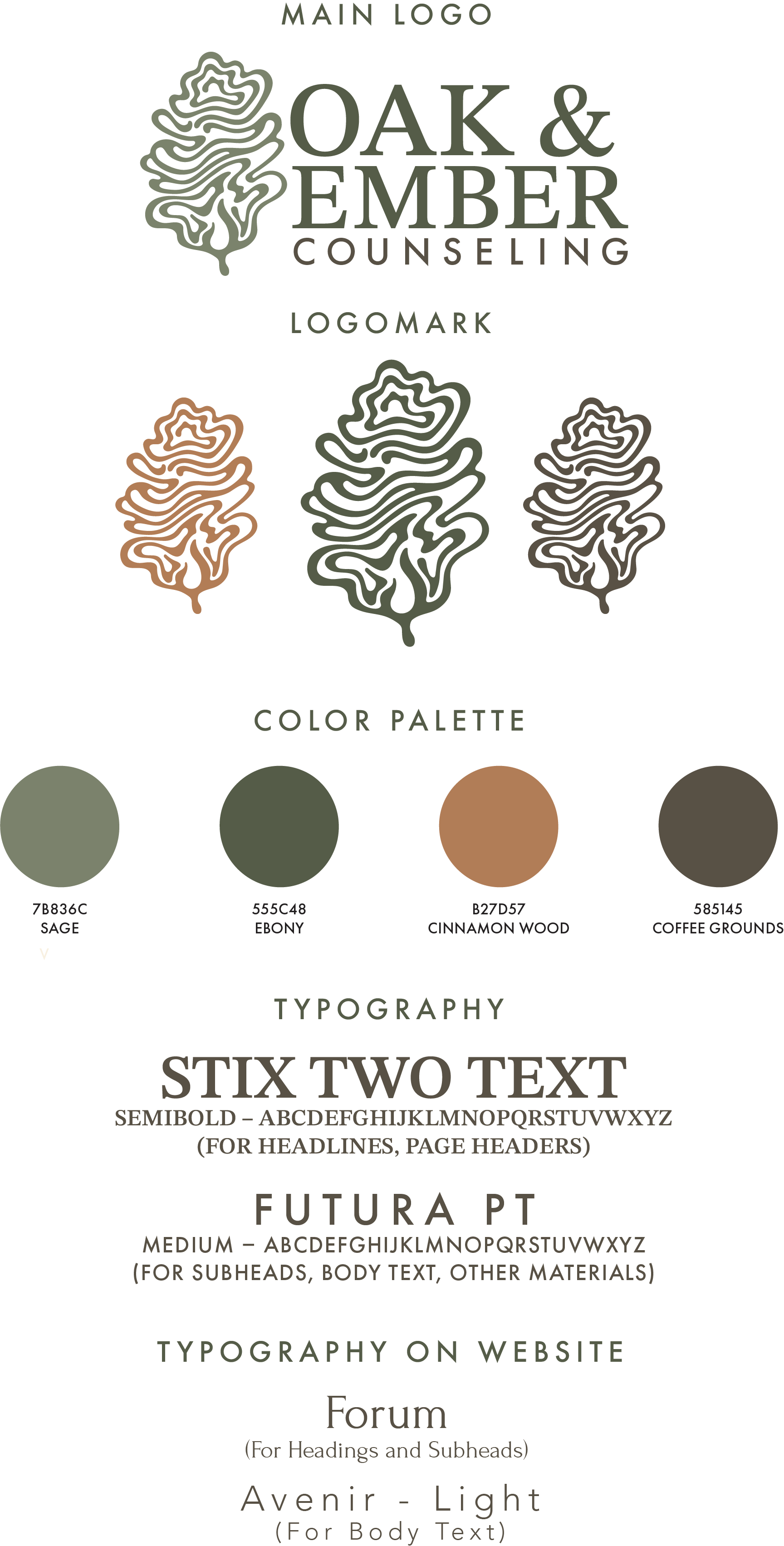
Following logo finalization, a full set of brand guidelines was created, including supporting graphics, typography standards, color palette selection, and overall usage rules to ensure consistency.
Style Guide

The project then expanded into website design and development, with the primary goal of creating a welcoming digital space where visitors can comfortably learn about therapeutic services, and feel encouraged to take the next step toward booking their first session. Before designing the website, understanding of necessary website components was discussed with the client. The need for simple, welcoming structure was requested along with integrations with Simple Practice to manage scheduling and billing services. Importance of clarity and descriptive pages was evident, along with aesthetically tying back to the newfound logo.
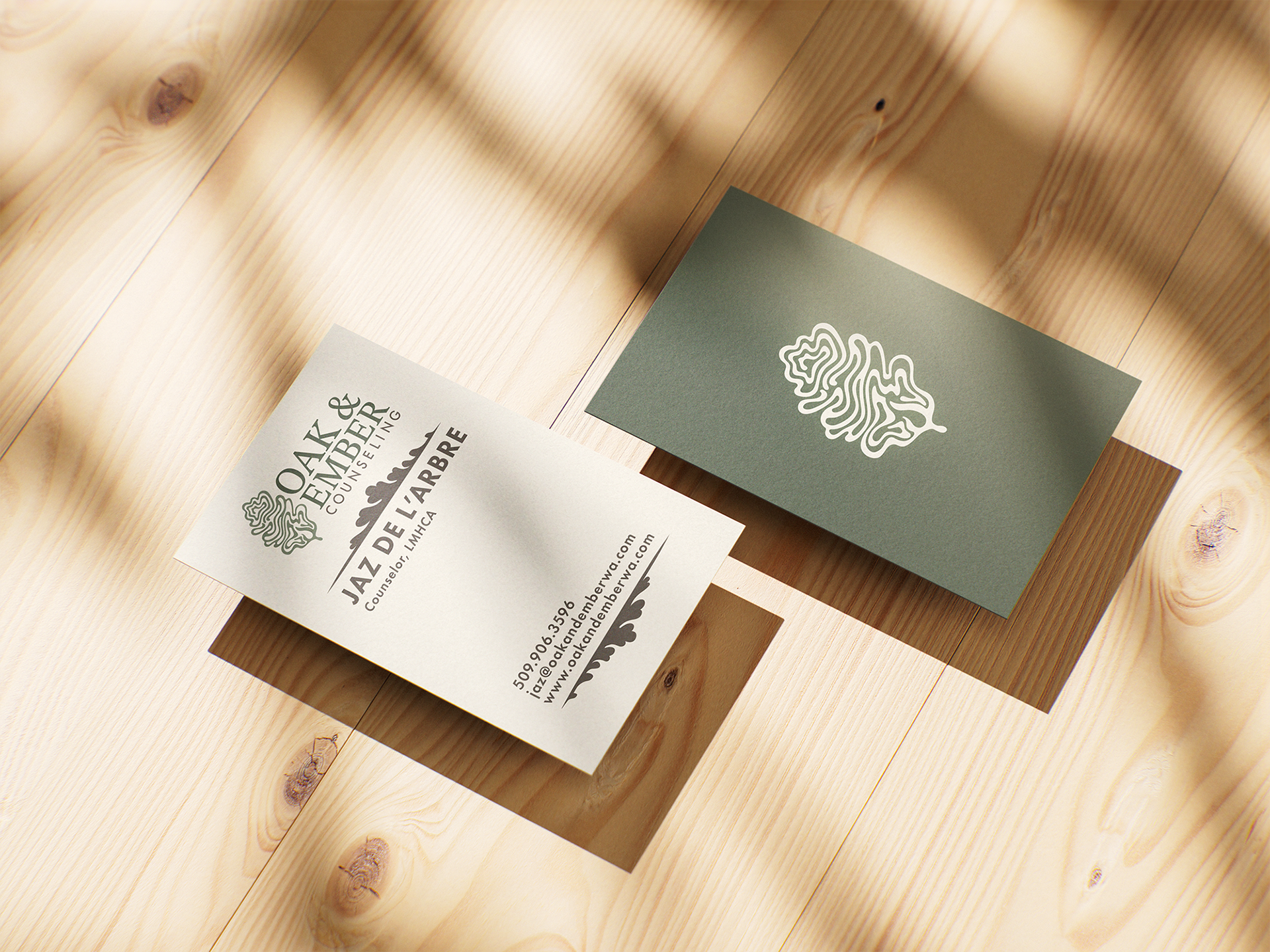
Finally, business cards were designed to provide the client with a professional and cohesive physical extension of the brand for networking and community outreach, and mockups of physical signage were created to show the client future possibilities, if in-person services are ever offered.
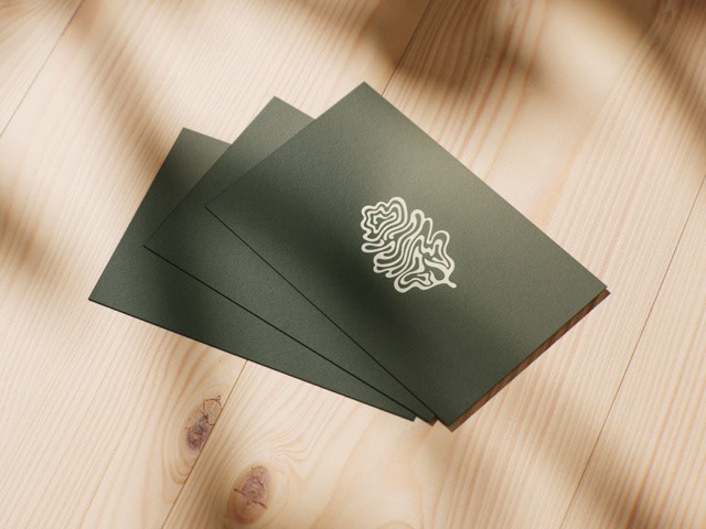
Stacked Business Cards Mockup
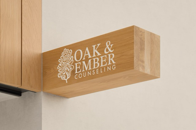
Signage Mockup